










Mobile App Design Services for Adoption and Growth
Most apps do not fail because they look wrong. They fail because someone could not finish what they came to do. Our mobile app design services find that failure point, in research or in your analytics, then fix it in the structure before anyone designs a screen. Design and engineering sit in one team, so what you approve is what ships. Starting a new product, fixing one that underperforms, or adding design capacity to your team.
Design work, measured four ways.
2,000 +
Products shipped
12M +
Active users on our interfaces
150 +
Prototype iterations on one build
45 %
Faster journeys on a rebuilt platform
What is actually going wrong in your app.
Users abandon at the same screen and nobody knows why. Support answers the same question every week. Reviews mention confusion rather than bugs. Your team argues about design opinions because nobody has evidence. A feature shipped and usage did not move. Every one of those is a structural problem wearing a visual disguise, and every one is diagnosable before a redesign starts.
Can we skip research and go straight to UI?
Sometimes yes. If you have a validated product, real usage data and a structure users already navigate successfully, we will tell you to skip research and spend the budget on the interface. If any of those three is missing, UI work becomes expensive guessing, and the guess gets built.
Why not use a template or a freelancer?
A template gives you a layout that solved someone else's problem. A freelancer can be excellent and is usually a single discipline, so research, interface, prototyping and handoff quality vary. Both are reasonable for a small internal tool. Neither survives multiple user roles, regulated workflows or a handoff to a team that did not draw it.
End-to-End Mobile UI UX Design Services
UX decides whether a person can complete the task. UI decides whether they trust the product while doing it. Both run on the same engagement here, sequenced so structure is validated before visual work begins. Explore which of these app design services matches where your product is:
Mobile Product Strategy
Our custom app design services begin by establishing what the product is for, who it serves and how success gets measured. Design decisions made without that framing produce interfaces that look finished and fail commercially.
Key Benefits & Outcomes
- A product brief that fixes scope before design starts
- Success criteria agreed before anyone opens Figma
- Feature priorities ranked against user and business value
- Product risks named while they are still cheap to change
Technologies & Process
We work through business goals, target audience, value proposition and the risks that could sink the product, then translate those into a prioritized feature set. On the Coca-Cola trade platform this stage produced the organising principle for the entire build: five buyer decision moments, discover, order, track, manage and get help. Every one of the 92 screens answered to one of them. Nothing was designed because it was expected. You receive a product brief, an assumptions log, a KPI framework and a prioritized feature list.
UX Research and Discovery
Our mobile UX design service replaces assumptions about your users with evidence from them. That means talking to the people who will use the product and to the people inside your business who know why it behaves the way it does.
Key Benefits & Outcomes
- Decisions grounded in evidence rather than internal opinion
- Real usage conditions accounted for in the design
- Stakeholder knowledge captured before it is lost
- An opportunity map showing where design can move a metric
Technologies & Process
Research combines stakeholder workshops, user interviews, competitive analysis and any analytics you already hold. Context matters more than most teams expect. For Classic Pool Tile and Stone the users were contractors aged 40 to 60 working outdoors in bright sunlight, so we designed for readability in those conditions rather than to a developer-default aesthetic. For Nokia Al-Saudia's Training Centre we worked through four distinct audience tracks with their team before sequencing any development. You receive a research plan, interview findings, an insight summary and an opportunity map.
Information Architecture and Flows
Users predict where things should be. Information architecture is the work of making the product match that prediction, and user flows are where the actual sequence of a task gets settled before it costs engineering time.
Key Benefits & Outcomes
- Navigation users can predict without instruction
- Edge cases and error paths mapped, not discovered later
- Every role sees only what belongs to that role
- Task sequences agreed before wireframes begin
Technologies & Process
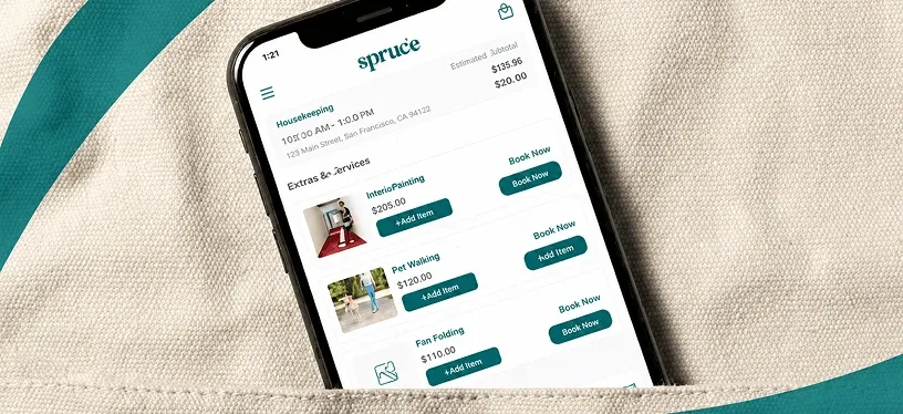
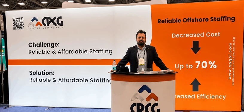
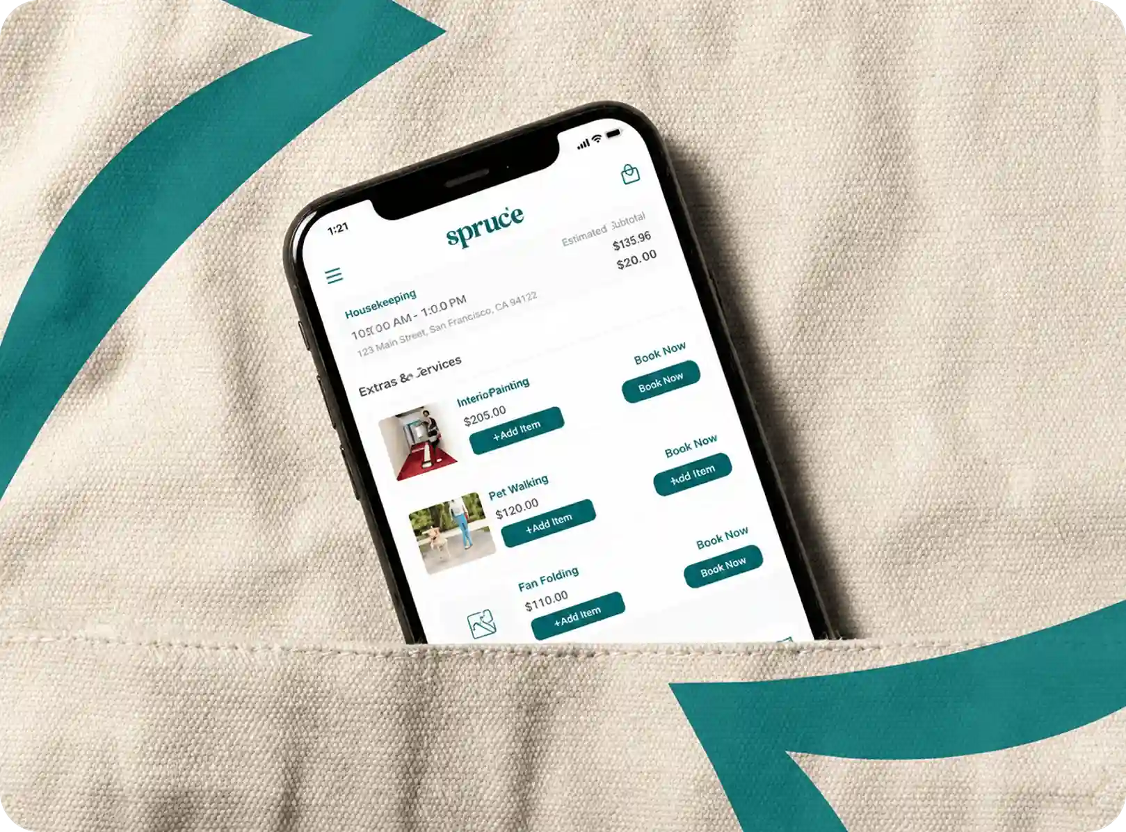
We map content, features and navigation into a structure, then diagram the steps, decisions and alternate paths for priority tasks such as signup, booking, payment and account recovery. Role structure is part of architecture, not a permissions afterthought. On Spruce we scoped role-based access across five user types before a single module went into development, and on CPCG we mapped four role levels each needing a different view of the same data. You receive a sitemap, navigation model, flow diagrams, a state inventory and an edge-case list.
Wireframes and Structure Validation
Low-fidelity wireframes test whether a screen’s structure and task sequence work while changes still cost hours. Applying visual polish to a flow nobody has validated is the most expensive habit in product design.
Key Benefits & Outcomes
- Structure agreed before visual investment
- Responsive and adaptive behavior specified early
- Stakeholder review on layout, not on color
- A screen map the whole team works from
Technologies & Process
Wireframes stay deliberately grayscale so review focuses on hierarchy, sequence and completeness rather than aesthetics. We annotate responsive behavior, empty states, loading states and error states at this stage, because those three account for most of the screens teams forget to design and most of the questions engineering asks later. You receive annotated wireframes, a screen map and responsive behavior notes.
Mobile UI Design
Our mobile UI design services turn a validated structure into a branded interface system: hierarchy, typography, color, spacing, iconography and every component state a developer will need.
Key Benefits & Outcomes
- Interfaces that follow platform convention while staying on brand
- Every component state specified, including the unhappy ones
- Dark mode and accessibility handled in the system, not bolted on
- A UI kit your future designers extend rather than replace
Technologies & Process
UI work builds on the approved structure, applying your brand where it exists and defining one where it does not. Components get designed in all their states: default, pressed, disabled, loading, error and empty, with microinteraction feedback specified for taps, gestures and transitions. Dark mode is specified where the product calls for it, as it was on the Coca-Cola platform. Type scaling, contrast and target sizes are set inside the system so accessibility is a property of the components rather than a later remediation pass. You receive high-fidelity screens, a UI kit and visual specifications.
Interactive Prototyping
A prototype lets stakeholders and users experience the product’s behavior before engineering builds it. It is the cheapest place to find out that a flow does not work.
Key Benefits & Outcomes
- Behavior reviewed and approved before development opens
- Priority journeys tested end to end, including errors
- Stakeholder sign-off on something they have actually used
- Fewer mid-sprint change requests during the build
Technologies & Process
We prototype at the fidelity the question requires. Low-fidelity linked wireframes test structure and navigation without visual bias. High-fidelity branded prototypes support stakeholder approval, usability sessions and investor demos. Onboarding and transactional flows get their own prototypes because they carry the most risk: on Coca-Cola we built dedicated tutorial flows for the four highest-friction moments, home, products, checkout and order history. That build ran more than 150 prototype iterations across 92 screens before production code began, and launched with zero critical bugs. You receive a clickable prototype with defined start points and shareable review links.
Usability Testing and Validation
Validation answers one question: can representative users complete the priority tasks in the design as it stands. Testing before development is what makes the difference between a design opinion and a design decision.
Key Benefits & Outcomes
- Failure points found before they reach production code
- Findings ranked by severity so fixes get prioritized
- Accessibility verified rather than assumed
- Design QA against the built app before release
Technologies & Process
Validation runs at two points. Before development we test the prototype against realistic tasks and rank findings by severity. After the build we run design QA against the implemented app, checking that what shipped matches approved behavior, states and accessibility specs. Accessibility validation covers contrast, target size, type scaling and labeling. The metrics that show design is working are behavioral: activation, task completion, time on task, error rate, conversion and retention. We agree which ones matter before design starts. The Coca-Cola platform was built to WCAG AA from the design phase, where accessibility was treated as market coverage rather than compliance paperwork.
Design Systems and Handoff
Handoff is where most design engagements lose their value. Files get delivered, questions start, and the built product drifts from the design. Our design and engineering teams sit together, so the spec gets built by people who can ask the designer directly.
Key Benefits & Outcomes
- Developers implement from specifications, not screenshots
- Design tokens keep the system consistent as it scales
- All design files and IP transfer to you in full
- The team that designed it is available while it gets built
Technologies & Process
We prepare inspection-ready Figma files: organized layers, named components, documented tokens for color, typography, spacing and elevation, exported assets at the required densities, and implementation notes on behavior the screens cannot show. Because engineering is in-house, feasibility questions get answered during design rather than after handoff, which is the single largest source of rework in outsourced design. You receive the Figma source files, a published component library, asset exports, annotations and a design QA log.

Mobile App Design and Development Services Under One Team
Design that engineering cannot build is a rendering. Our designers and engineers work the same product, so feasibility gets tested during design and handoff is a conversation. For custom mobile app design and development under one contract, send your product idea and a US-based architect returns a written scope and cost band in 48 hours.
What UX design covers.
UX design decides whether the product works. It covers research into who the users are and what they want to do, the information architecture determining where things live, the user flows that sequence each task, the wireframes that test that sequence, and the validation that proves it. UX output is structural: flows, maps, states and tested wireframes. When UX is wrong, visual quality cannot rescue the product, because the person still cannot finish what they came to do.
What UI design covers.
UI design decides whether the product feels trustworthy and clear while someone uses it. It covers the visual system, typography, color, spacing, iconography, component states, motion and platform conventions. UI works on top of a validated structure. The two connect at the component: a UX decision about how a task should flow becomes a UI decision about which control expresses it, and both get documented in one system so engineering builds a single coherent thing.
Three projects where a design decision, not a feature, changed the outcome.
Results Delivered by Our Mobile App Design Agency
Technology
Two native builds and two cross-platform, so you can see the reasoning rather than take the claim.
Designing 92 Screens Around Five Decision Moments
Coca-Cola's UAE trade buyers ordered by phone because no product existed worth using. We organized the entire design around five buyer decision moments rather than a product catalog, ran more than 150 prototype iterations before production code, and built to WCAG AA from the design phase.


Engagement Models and App Design Cost Factors
Mobile app design cost tracks four things: how many screens, how much research, how many platforms and how much validation. A focused MVP design engagement is a different order of work from a multi-role enterprise redesign.
What moves the number on a design engagement.
Screen count is the obvious driver and the least interesting one. Research depth matters more: stakeholder workshops and user interviews carry weeks a design-only engagement does not. Then user role count, because each role is effectively a separate product surface. Then platform count. Then validation scope, meaning testing rounds and whether accessibility is verified or assumed. Localization and right-to-left support each add real work.
What a design engagement includes.
Research and discovery, information architecture, user flows, annotated wireframes, high-fidelity UI screens, a UI kit, an interactive prototype, accessibility specifications, exported assets, developer annotations and a design QA log. Published phase-level ranges for reference: UX research and discovery $500 to $8,000, wireframing and UX mapping $1,000 to $10,000, UI design and visual styling $2,000 to $25,000+, prototyping and usability testing $1,000 to $15,000.
How Long Mobile App UI/UX Design Takes
A medium engagement of 15 to 40 screens runs two to four weeks. What decides where you land is settled in the first conversation.

Under 1 hour
First response in US business hours. The first question is how many user roles the product has, because roles drive screen count more than features do.
Explore Our Design Process
48 hours
You receive a screen estimate, a research recommendation, the platform approach and a cost band, priced against scope rather than against a guess.
See How We Plan Projects
1 to 2 weeks
Your design team is assigned and discovery opens with agreed success criteria and a stakeholder schedule.
See How We Build AppsWhat you receive, stage by stage
Mobile App Design by Industry
Industry changes what the interface has to survive rather than how it looks. A healthcare app has to make an access event visible before it does anything else. A logistics app has to stay usable with no signal. A commerce app is judged on one number, which is completed purchases. Find your sector below.
-
Patient apps, scheduling, remote monitoring and care coordination, designed so a clinical user can complete a task under time pressure. We design HIPAA-aware workflows and are ISO 27001 certified. For Collaborative Patient Care Group we designed four role levels, each with a tailored portal and scoped permissions, across a distributed healthcare support network.
-
Payments, onboarding, KYC, statements and credit visibility, where a moment of doubt costs a transaction. Design work concentrates on error states, confirmation clarity and progressive disclosure of complex terms. We design PCI DSS-aware payment flows. On the Coca-Cola platform we designed invoice management, payment history and credit position into a self-service surface.
-
Product discovery, cart, checkout and reorder, judged on completed purchases. For Coca-Cola’s UAE trade channel we designed a 92-screen B2B commerce experience around five buyer decision moments, including barcode scan-to-reorder for staff doing a stocktake, and the platform launched with 45% faster user journeys.
-
Listings, tenant portals, service coordination and agent tools, usually with several roles sharing one product. On Spruce we designed across five user roles, including a dedicated service professional app for people working on site rather than at a desk.
-
Learning, assessment and certification interfaces reaching students on whatever device they own. For Nokia Al-Saudia’s Training Centre we designed around four audience tracks rather than a feature list, so a self-paced learner and an on-site attendee each get controls that match how they are actually studying.
-
Driver, dispatch and tracking interfaces built for a phone held in one hand in a loading bay with no signal. Offline behavior and conflict resolution are design decisions taken in discovery, not features added later.
Why Businesses Choose AppVerticals as Their App Design Firm
Most design engagements fail at the same two points: research that never happened, and a handoff nobody owns. Both are structural, so choosing a mobile app design firm is really about which one solved them before the engagement started.
Designers and Engineers on One Team
Our design work is checked for feasibility by the engineers who will build it, during design rather than after handoff. That removes the most common source of rework in outsourced design, a specification that cannot be built as drawn. The designer stays reachable during the build.
Accessibility Designed In
The Coca-Cola trade platform was built to WCAG AA from the design phase. Contrast, target size, type scaling and labeling live in the component system, so accessibility is a property of the interface rather than a remediation project before launch.
You Own Every File
Figma source files, the component library, asset exports, documentation and full IP transfer to you. No proprietary format, no locked library, no dependency on us to make the next change.

Verifiable Proof
2,000+ products shipped, 12M+ active users, 1,000+ clients served.

Recognized Work
Inc. 5000, ISO 27001 certified, 4.9 on Clutch, CSS Design Awards Special Design Kudos.

Named Ownership
A named delivery lead and a US-based solution architect on every engagement.

Communication
Two-week sprints, sprint demos you attend, milestone pricing, NDA first.
Launch with the product, the codebase and the Play Console account you need to scale without depending on us.


Most teams I talked to wanted a spec they could just go build. I didn't have one, nobody had solved this. AppVerticals sat in the hard part with me for a year, and a lot of those weekly calls were them telling me honestly what still didn't work. When it finally clicked, it was exactly what I'd been chasing.
Our Mobile App Designing Process
Our mobile app designing services run in seven stages, each with a defined input, a named output and an approval gate. The sequence follows design thinking discipline: understand the problem, then test the solution before building it. You approve every gate.

Stage 1 — Discovery and product framing
We establish business goals, audience, success criteria and constraints, then agree what the product must do before deciding how. Input: your goals and any existing product. Output: product brief, assumptions log, KPI framework, prioritized features. Gate: you approve the brief before research begins.
Stage 2 — UX research
Stakeholder workshops, user interviews, competitive analysis and any analytics you hold, turned into findings rather than opinions. Input: approved brief, access to users and stakeholders. Output: research plan, findings, insight summary, opportunity map. Gate: you approve the insights that will drive design.


Stage 3 — Information architecture and flows
Content, features, navigation and role structure organized so users can predict them, then priority tasks diagrammed step by step including alternate paths. Input: research insights. Output: sitemap, navigation model, user flows, state inventory. Gate: flows signed off before wireframing.
Stage 4 — Wireframes
Grayscale screens that test structure and sequence, annotated for responsive behavior and for empty, loading and error states. Input: approved flows. Output: annotated wireframes, screen map. Gate: structure approved before visual work starts.


Stage 5 — UI system
The interface system: typography, color, spacing, iconography, component states, dark mode where required, built on platform conventions. Input: approved wireframes and brand inputs. Output: high-fidelity screens, UI kit, visual specifications. Gate: visual direction approved.
Stage 6 — Prototype and validation
Priority journeys assembled into a clickable prototype and tested against realistic tasks, with findings ranked by severity and folded back into the design. Input: UI screens. Output: interactive prototype, findings, revisions. Gate: validated design approved for handoff.


Stage 7 — Handoff, design QA and iteration
Inspection-ready files, tokens, assets and annotations delivered to engineering, then design QA against the built app before release. Input: approved design. Output: Figma source, component library, annotations, design QA log. Gate: QA sign-off before store submission.
What actually delays a design engagement.
Design rarely runs late because design is slow. It runs late because decisions are unowned. Stakeholder review with no named approver produces rounds that never converge. Brand direction arriving mid-project resets the interface system. Role structure discovered in week three reopens the architecture. We set approval gates at each stage with one named approver on your side, and we settle role structure in discovery, because roles are the single largest driver of screen count.
Three Ways to Engage Our Design Team
Design engagements arrive in three shapes, and the right one depends on whether you have a product yet, a product that needs fixing, or a roadmap that needs sustained design capacity.
Founders and teams designing a first product or a new line.
Full engagement from strategy through handoff:
Existing apps with drop-off, poor reviews or an interface that has aged.
A UX audit of the live product, a redesign roadmap, before-and-after flows, refreshed UI and a migration-ready design system.
Products with a continuing roadmap needing design capacity that does not restart each quarter.
An embedded design team with a named lead, working your backlog alongside your engineers.
Bring Your Analytics to the First Call
Thirty minutes with a solution architect and a designer. If you have an existing app, bring your analytics and store reviews, because drop-off data is the fastest route to an accurate scope. If you are starting fresh, bring the feature list. You leave with a screen estimate and a cost band. The written scope follows in three business days, NDA first.
How to Compare Mobile Design Agencies
Buyers researching which companies offer mobile app design services find identical claims from every mobile design agency. Six things actually separate them, and here is where we stand.
Portfolio screens show visual capability. Ask what research produced them: who was interviewed, what was tested, what changed as a result. The honest way to compare the best mobile app design services is by the research behind the screens.
An agency that agrees with every request is selling hours. We advised Classic Pool Tile and Stone against a second desktop platform because their crews already carried one device, and that recommendation cost us the work.
Request the handoff artifact list: source files, component library, tokens, asset exports, annotations, accessibility specs. Vague answers here predict rework, because the gap gets filled by developers guessing.
Ask how their iOS work differs from their Android work. If the answer is that the designs are the same, they are designing one product and shipping it twice.
Ask whether contrast, target size and type scaling live in the component system or get checked before launch. The second answer means a remediation project you will pay for later.
Source files, component library and IP should transfer to you. Confirm it before signing, not at handoff.
FREQUENTLY ASKED QUESTIONS
Mobile App Design FAQs
Start With a Scoped Design Conversation
A first call covers your users, your platforms, the screens in scope and the research the product actually needs. You leave with a screen estimate and a cost band whether or not you work with us. NDA first.