- AI verticals
Intelligence built into your products and operations. Consulting, custom models, agents, and copilots designed around how your business actually runs.

The AI-native system behind every project.
Get AI ConsultationAI Services
Generative AI Services
Machine Learning Services
Company
- Industries
Comprehensive App & Software Development across 20+ industries
Awards & Recognitions

 All IndustriesTrusted and Recognized by


- From fast-moving startups to Fortune 500 enterprises.
A future-focused tech partner building, shipping, and scaling products for some of the world's most demanding companies.
View All Case Studies










How We Made a 5G Chip Startup's Invisible Product Make Sense to Customers, Investors, and the Press
EdgeQ's Brand Website Design & Build
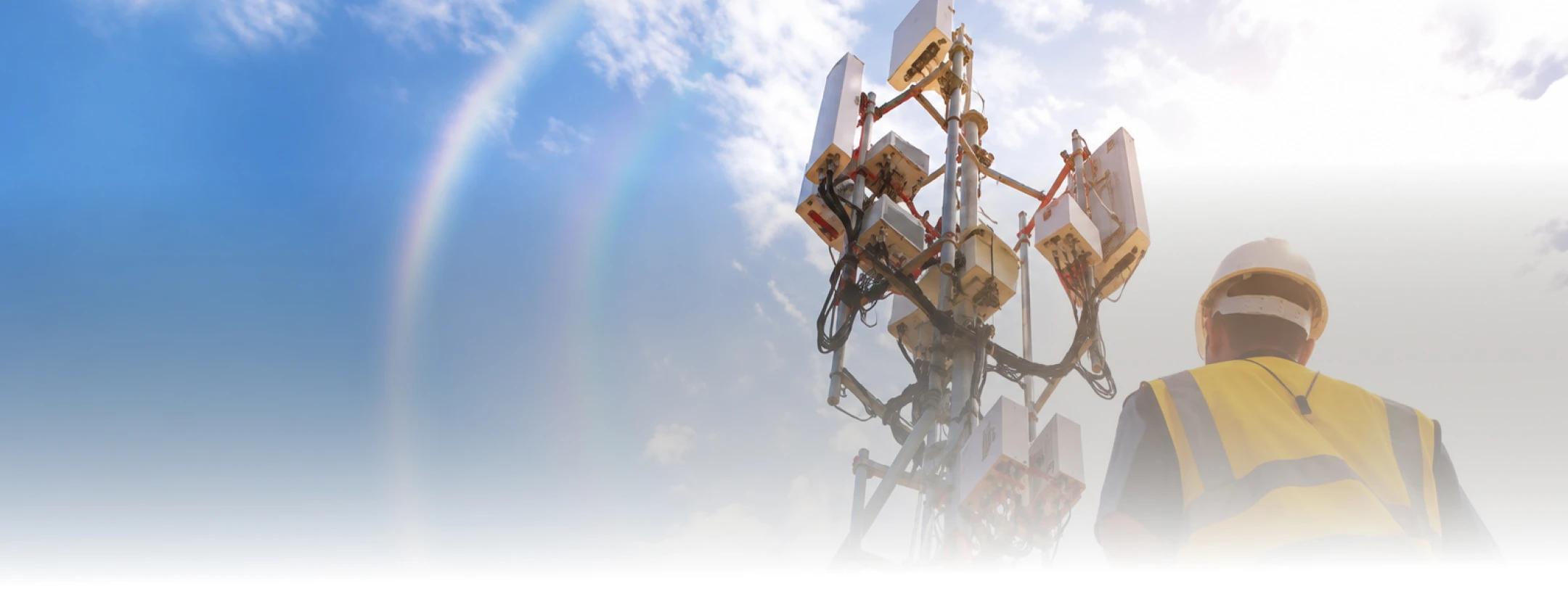
EdgeQ builds a Base Station-on-a-Chip. Their site was blue, static, and organised as a list of information for three audiences that want opposite things — engineers, investors, and journalists. We designed and built six pages around one scroll: dark to light, towers in the distance closing in, and the chip revealed at the end as the thing behind all of it. Launched 13 February 2022 on AWS.
The Impact
A Santa Clara chip startup whose product is invisible and is also the entire story
EdgeQ is a 5G semiconductor company in Santa Clara building a Base Station-on-a-Chip, selling into telecom infrastructure, client devices, and enterprise networks. Their audience is engineers, investors, journalists, and prospective customers, technical enough to spot hand-waving, senior enough to leave if the page wastes their time.
They came in with a logo, an orange accent colour, no wireframes, and an open question about everything else.
Three audiences, one home page, and a product you cannot photograph
EdgeQ’s existing site was blue, static, and built as a list of information.
That list had to satisfy an engineer who wants the chip stack diagram, an investor who wants the market thesis, and a journalist who wants a story they can file by deadline. Serve any one of them properly on a single page and the other two leave.
Underneath that sat a harder problem. The product is a chip. You cannot photograph it in a way that means anything to a non-engineer, and you cannot explain what it replaces in a headline. For a company whose next customer is a telecom operator and whose next raise depends on people believing the story, a website that reads as a specification list costs real money.

Why we moved the product off the home page and made it the ending
Three weeks in, we were reviewing a home page design that was working, and it was working for the wrong page. The layout put the chip at the center with technical traits around it, precise, dense, and exactly what an engineer arriving on the Technology page would want. We said so. The narrative moved to the home page, the product design moved to Technology, and the two pages stopped competing for the same job.
That split set the sequence. The home page then needed a spine, so we inverted the original flow to run big to small: open dark, text only, then let the imagery lighten section by section as towers appear in the distance and close in. At the vision section the page turns fully white. Connections trace into a tower, the view zooms, and the chip resolves as the thing that had been behind all of it. One call to action. The Technology page picks up where that reveal leaves off, chip stack diagram first.
One decision was deliberately unglamorous. We used abstract imagery in the early sections instead of photographing specific applications, because a chip startup’s market focus shifts and we did not want their home page pinned to a market list they might outgrow. That call has aged well.
A Digital Platform Built Around the Story
One focused website connecting technical credibility, company identity, and audience needs.
What happened when the client changed direction in week five
On 1 December, EdgeQ decided the site should move from simple to clean with real animation and visual flair. That is a bigger site than the one we had priced a schedule around, and the 15 December soft launch came off the timeline in the same meeting, by joint decision, with a new date agreed. We launched on 13 February.
We could take that hit because of how the project was run. Twice-weekly design reviews with the EdgeQ team, and every direction change written into Confluence the same day it was made — fifteen sessions, each with its own dated decision list. From 10 December, EdgeQ had direct access to the Figma workspace, so they watched the design move rather than waiting for a presentation of it.
| Cadence | Who | What they got |
| Twice weekly | EdgeQ team + our design and dev leads | Live design review, decisions logged and dated the same day |
| From 10 December | EdgeQ | Direct Figma access to the working files |
| 9–13 February, daily | EdgeQ | Page-by-page delivery with a status board per page |
| 13–18 February | EdgeQ | Launch, then a defined window for functional fixes and in-scope revisions |
The last week ran on daily deliveries. Home, Technology, Media, and Company each had a named list of items due per day, with Career and Contact already closed out. When something could not make the 13th, it went onto the 14–18 February list in writing rather than quietly slipping.
What EdgeQ launched, and what their own team could run without us
EdgeQ launched with six pages carrying one continuous idea: an invisible product introduced through the world it operates in, then revealed. An engineer landing on Technology got the chip stack diagram first. An investor got the market thesis and the vision section. A journalist got press releases separated from coverage, and events split into upcoming and recent — a media page that could be used rather than read.
The infrastructure moved with it. WordPress on AWS EC2 with Shield, a staging environment, and role-based CMS access, so EdgeQ’s own team could publish without a developer.
The markets EdgeQ serves have changed since launch. The home page was built so that list could change without a photo reshoot.
Testimonials
"They told us the design we'd approved was the right design for the wrong page. That is not a comfortable thing for an agency to say in week three, and it was the single most useful piece of feedback we got. When we changed direction on the whole site in December, they re-planned with us in the same meeting instead of defending the old schedule."

We have designed this exact problem for a semiconductor startup, narrative for the people who need the story, depth one click away for the people who need the diagram.
Selling something technical to three audiences that want opposite things?
Start the conversation