In terms of acquiring quality website design that does not only capture attention but also leaves impressive influence over website visitors has become more challenging than ever. As there are millions of web design companies selling website design beyond expected price, might convenience you well enough to buy their service to get best business website designs but today, lack of technical knowledge might result in affecting your website and your budget too. Therefore, today we are here to reveal three major mistakes that can drastically affect your website and can lead it to the downfall in no time.
Be Responsive
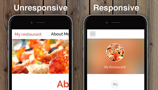
Readability is a crucial point to focus once after you receive your website. Know your website is responsive and perform flawlessly, regardless of any size of screen it meets. Make sure that your website fits all types of device screen i.e. Desktop, Mobile Phone, Laptops, and Tablet screens because hindrance in viewing website affect site visitors and leave them confused with disturbed website alignment and cause users to quit and move to another site in no time. These mistakes are common factors that are even found in best business website designs so make sure to avoid them immediately. Here are facts that indicate factors that make users to quit site or is difficult to perform.
Facts:
94 percent users reject site due to unattractive website design
84 percent user’s’ state relate website design as number one factor to determine business credibility.
38 percent will stop engaging and abandon that has unattractive web layout.
Details & Contact Information
All efforts are to make process easy, accessible and all above it should be user-friendly. While you opt for custom website design make sure that important information should be placed at the front, one does not has to hop to six pages to get contact information. Scheduling, quick form submission to important web products and services should mention at the top left or right menu along with contact number. With clear menu, contact info and days/hours can build stress-free engagement between users and your website will gradually lead to building more clienteles with a focused approach.
Definite Call to Action
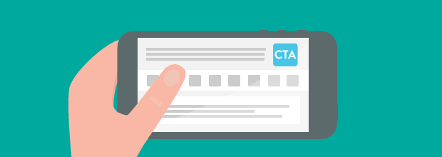
Call-to-Actions (CTA) are often placed on the wrong side that distorts users. You have set a website to help and assist for a purpose, let say you help small business with services and you want to know that you are ready to serve them. A clear CTA that can be a button to certain text that leads them to the right directions that they might look for as soon as visiting your site. Place CTA such that it drives them to contact without having to scroll or search more about the product/services.
In terms of acquiring website design and its layout, there are a few crucial design components that require clear direction before development to ensure they serve their purpose—boosting user engagement and enhancing site functionality. To achieve a quality website design that incorporates user-experience-focused strategies and custom design elements, explore our web application development services to give your business a competitive edge.