
Modern responsive design is made feasible through media queries. With these, you can configure various stylistic options based on the user’s choices, device capabilities, or screen size. However, how do they operate? Which ones are available, and which ones ought to be used? Here is a comprehensive guide to media queries:
How do media queries work?
A media query is what? It is possible to conditionally apply styling based on a media type, a media feature, or both using a media query or a particular CSS feature. Media queries provide many additional functions, just checking the screen dimensions and applying CSS accordingly.
How to structure a media query
The general format of a media inquiry is as follows:
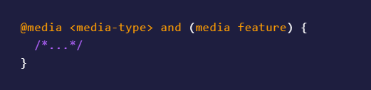
A media type, zero or more media characteristics, and the @media keyword, often known as an “at-rule,” are optionally included in the beginning.
An actual case of a media inquiry is:
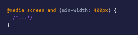
This means, in plain English, “use this CSS if the site is being displayed on a screen and the width of that screen is at least 400px wide.”
This is a legitimate media rule because the media type and the media feature are both optional:
Also Valid:
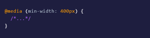
If the media type is omitted, it will be interpreted as the media type all, which is typically acceptable.
Logical operators
We also have a few “logical operators” that sit between media type and media features: and, or, & not. Here’s how they operate:
The and Operator
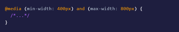
The “and” operator can “chain” many media features together, rather than merely between a type and apart. For example:
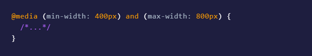
Which instructs a browser to use this CSS when the width is 400–800 pixels.
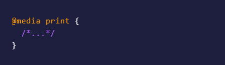
The or operator: (a comma)
To “or” operator uses a comma like follows:
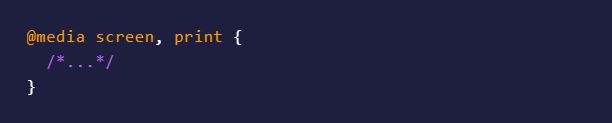
It applies to either print or screen. Every comma-separated line represents a separate media query, and the media query’s CSS is applied as soon as one of them evaluates to true. You will quickly be able to omit the comma and use the word or instead.
The not operator
Last but not least, the statement there is not can be used to refute a whole media query. To avoid printing, the following query will be used everywhere:
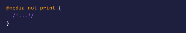
You must also specify a media type (such as screen or print) if you use the not operator. If you don’t, your media query will read “not all” and won’t be applied anywhere because the media type will be all.
Not completely inverts the media query. For a forthcoming feature that will let you negate just a portion of a media query, scroll down to not() notation.
The only other operator is logical, but you don’t need to use it in contemporary browsers, so we’ll pretend it doesn’t.
Nesting
Media queries can be nested inside of other media queries,
Also valid
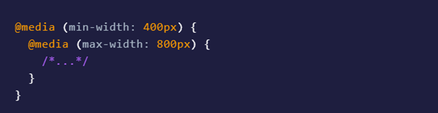
In this case, it might not be as helpful, but you could wrap all of your CSS in a @media screen, use nested media queries for responsive design, and have a fully customized print stylesheet after that. That will appear a little cleaner after this.
Imports
To conditionally import the file, you can optionally add one or more comma-separated media queries to the import statement, for example, as follows:
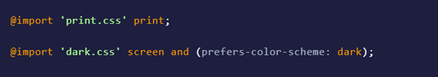
The CSS won’t be applied if a media query doesn’t match, but the file will still be downloaded.
HTML media query
A media query can also be used in HTML, for instance, in the style or link tags, like in the following example:
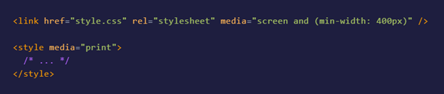
It’s important to know that your browser will still download any associated data even if a link doesn’t apply.
The img element with a sizes attribute and the picture element with distinct source elements that each have a media attribute can also be used to determine which responsive image loads using media queries. Still, since it’s a big topic and is unrelated to CSS, we’ll leave that for another tutorial.
Media Formats
The term “media type” refers to the category of hardware that a browser is currently running on. There formerly were a tonne; however, the level 4 specification deprecated a tonne of things that were never implemented anyhow, leaving us with just 3:
- All
- Screen
All
As previously stated, the default media type is “all,” which means the CSS will be applied to all devices if you don’t provide a media type.
Screen
What you’re most likely viewing this article on right now!
Printing pages or other “paged” media (such as a book! Did you know that books may be marked up with HTML and CSS?
The Use Of Media Queries
It’s a good idea to establish a few standards for yourself when using media queries so that you don’t add media queries haphazardly and create CSS that is challenging to manage and unpredictable in its behavior.
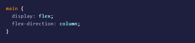
In this method, you’re always designing “up,” and your CSS is still simple to understand: Every CSS you create will be supplementary to the base styling. Your original CSS may have organized items into columns:
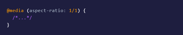
Aspect Ratio
With the aspect ratio and orientation media tools, you can check the relationship between width and height.
Aspect-ratio media characteristics like min-aspect-ratio and max-aspect-ratio are also available, which are more beneficial. You can use it to see if a browser adheres to a specific width-to-height ratio. In this case, the width is represented by the first number and the height by the second. In other words, a 2/1 aspect ratio is twice as wide as it is tall.
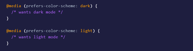
Prefers-color-scheme
You can determine if a user likes viewing a dark or light mode version of your website using the preferred-color-scheme function.
Some people may like dark mode because it is more comfortable for their eyes, their surroundings are gloomy, or they are sensitive to bright lights. Users may prefer your light mode if they visit your site in a bright environment or if the contrast is typically raised.
how to use css media queries for responsive design
tips on how to use css media queries for responsive design. In depth guide on using css media queries in responsive design.
Credits: AppVerticals