
Mobile navigation designs offer users quick solutions to help them do and discover what they want. They come in a variety of visual patterns. In order to improve user-app interaction, mobile app navigation acts as a between the user and application.
There are various navigation layouts, each with advantages and disadvantages, as well as varied user reactions and feelings depending on the type. This mobile app navigation guide was put together to assist designers in choosing the best navigation pattern for their iPhone, iPad, tablet, or other mobile app projects.
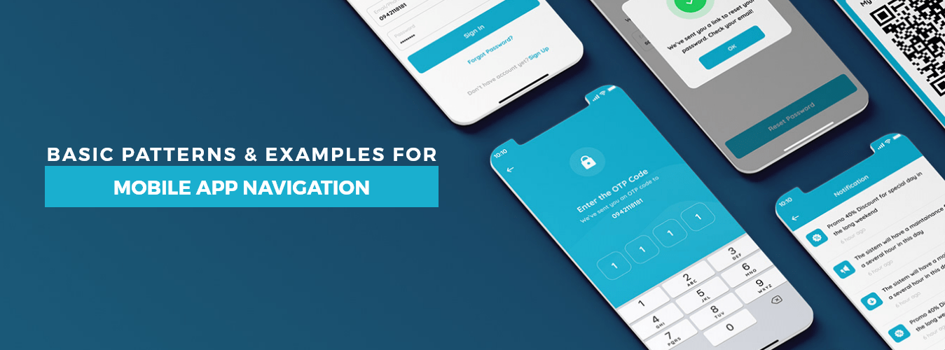
Top 8 Examples of Mobile App Navigation
Tab Bar
The top-and-bottom navigation bar comes from the desktop layout. Websites and desktop apps with navigation bars display shortcuts to key pages and useful features along the upper portion of the app screen.
On mobile, however, this has changed into a more straightforward icon bar with huge icons that make it clear which icon stands for what. The app’s most crucial parts or categories include three to five buttons, depending on the designer. Exploring deeper pages within the program is frequently visible and placed at the screen’s top or Bottom.
Even when users scroll up and down the app interface, the tab bar is constantly visible on the screen and differs in appearance from the navigation bar.
Hamburger
The hamburger menu (also known as the side drawer) is one of the most widely used navigation patterns on mobile devices. The drawer panel enables you to conceal the navigation beyond the screen’s left margin and only display it in response to user input.
The hamburger menu’s main drawback is that it is difficult to find; hence it shouldn’t be used as the primary navigation menu. For secondary navigation alternatives, this design can be the right choice.
Destinations or features that are secondary navigation alternatives are only relevant to users under specific conditions. Because they are secondary, they can be demoted to less prominent visual areas as long as users can quickly locate a utility when needed.
3D Touch
3D touch is the newest player in the mobile app navigation market. Apple introduced it and included certain crucial activities users must perform to use the app. It assists designers in creating a navigation shortcut. It’s a great way to give users a sneak peek at the content.
This function has been introduced to Dropbox’s Home screen activities and peek and pop. Quick operations like photo upload, search, and most recent file updates make the program easier to use.
Full-Screen Mobile App Navigation
The full-screen pattern adopts the exact opposite strategy from the other patterns covered in this article, making it much more difficult to minimize the navigation systems’ area. This kind of mobile app navigation typically dedicates the entire home page to the navigation. Users scroll up and down the menu, tapping or swiping incrementally to expose new items.
This approach is especially effective in websites and apps that are task- and direction-based. Because users frequently stick to just one branch of the navigation hierarchy at a time. Funneling readers from broad overview pages to detail pages lets them zero in on their search criteria.
UI Cards
UI cards are the best way to stand out in a design pattern. The cards can be customized and have a stunning visual appeal. You may use them to provide consumers with bite-sized information using a combination of text, graphics, and links.
The cards enable users to peruse information rapidly without an onslaught of data. The cards’ enormous adaptability and speedy change to various screen sizes open the door for responsiveness. The Pinterest app is the best demonstration of UI cards. It creates a straightforward but aesthetically pleasing app.
Rudder
You may have already encountered this style of navigation menu design if you use dating or food ordering apps. Because the primary button that opens the menu frequently resembles a steering wheel and is spherical, this common mobile navigation style is known as a steering wheel. The menu items on either side of this button will appear when it is pressed to display the menu.
Bottom Mobile App Navigation Bar
The Bottom navigation bar on the user side enables one-handed use of the thumb to swipe through the application’s tabs. You may prevent the issue of people not seeing your menu by raising all of the necessary buttons with links to the appropriate portions of the application. It’s an easy plan to draught and put into action. However, it isn’t a novel or inventive approach at all. It’s a tried-and-true menu that’s easy to use. It is incredibly portable and useful.
Conclusion
The importance of designing a mobile navigation menu has been discussed in this article. You can use your own template or focus on one of the seven widely used templates we provided if you want to be safe.
We at AppVerticals are delighted to assist you in implementing a project of any complexity with best practices for mobile app navigation. Contact us, and we’ll work to identify the ideal solution for your product. Hire the best app developers from USA’s leading app development company.